
Mile
Zero
August 31, 2011
Bass Check
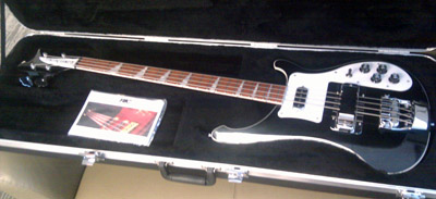
Last week I achieved a goal that I've had for seven years, one that's even documented back in the earliest days of this blog: I bought a Jetglo Rickenbacker 4003 bass. Bass Northwest may have one of the world's most hideous store websites, but they delivered where it counts. And while I was there, putting my name on the list to get this bass, they told me an interesting story.
Rickenbacker only makes fifty basses a year, they said, and those basses are made in what (from a store's perspective, not Rickenbacker's) is essentially a random order. The company doesn't tell stores what color or type they're making on any given day, or when they can expect an item to arrive. Instead, a store will just get a note from the Rick factory in response to their standing order, letting them know that an instrument is on the way. You might think that this unpredictability would make it difficult for stores to sell these basses, but in fact the extreme rarity of Rickenbackers (not to mention the voracity of their fanbase) means that they find homes almost immediately.
Why does the Rickenbacker company make so few instruments each year? I don't know the exact reason, but I suspect it has a lot to do with it being a family-owned business--one that's extremely possessive of their designs (Ric is notoriously litigious towards "generic" versions of its guitars) and therefore still builds everything here, where they can retain close control. The management at Ric is obviously really proud of their domestic manufacturing. Each bass comes with a little "made in USA" sticker on the pickguard, which (on a black and white instrument) makes it look a bit like it's wearing a flag pin on its lapel. I almost expect it to run for office.
For whatever reason they've chosen to do it, Rickenbacker's stubborn refusal to move production overseas stands out. Practically nothing else that I own is built here, musical or otherwise. It's possible that a lot of things can't be produced domestically anymore: the New York Times had an article the other day on bringing manufacturing back to the US, and the difficulty of reviving an industry after so much of the skills and infrastructure supporting it have been outsourced. It turns out that manufacturing, which would seem like a largely solved problem, really isn't--and it's not easy to catch up if we fall behind.
Stop me if I get too Friedman-esque, but for me, seeing that little flag sticker on my new bass highlights a tremendous tension in today's globalized marketplace. I think Rickenbackers are probably designed better than instruments built overseas (they'd have to be, since there's no economy of scale to subsidized waste) and I like that their manufacturing is subject to our regulation. But the irony is that I might not have learned to play bass if everything was made like (and cost as much as) a Rickenbacker. My first bass, which I still own and play, was a $300 factory-made Yamaha BB404 from Taiwan.
So I'm trying not to be incredibly snobby about where my new bass is made, because I owe my ability to play it to cheap construction. Simultaneously, though, I think there's a lot of value in Rickenbacker's model, and I wish we did more to encourage domestic production--not out of jingoism, but as a way to keep our skills sharp and our products humane. Maybe that's a lot of baggage to lay on a single bass, but I've been waiting seven years for it, after all: I think it might be forgiveable to obsess a little.
August 23, 2011
Software Patents Must Die
Patents are important. They create an incentive for inventors to release their inventions into the public domain in return for a temporary monopoly on those inventions. Everybody loves patents. Software patents, on the other hand, must die.
Lately there has been a lot of news about patents, as almost every mobile company in existence is suing every other company for infringement. That many happy lawyers should have been a warning sign that something fishy was going on. And this being the Internet, everyone online wants to leap to the defense of their favorite. But ultimately, there are no winners in this game, because software patents have done nothing but harm innovation. They're counter-productive, anti-competitive, and insulting.
The most well-written defense of software patents that I've seen comes from Nilay Patel, who is a former lawyer, and focuses mainly on why patents in general are beneficial to society. I don't have any issues with that. But let's examine his claims on software patents in particular, as a way of getting at why they're broken. He writes:
Patents publicly disclose some of the most advanced work ever done by some of the most creative and resourceful people in history, and it'll all be free for the taking in several years. Stop offering patent protection and there's no more required disclosure -- all this stuff stays locked up as trade secrets as long as it offers a competitive advantage, after which point it may well be forgotten.
...
What might surprise you is that the USPTO has historically resisted efforts to patent software, only to have the courts chart a different course. The conflict itself is a simple one: software is ultimately just the automated expression of various algorithms and math, and you can't patent math. To many, it then seems like a forgone conclusion that software patents shouldn't exist -- preventing other people from using math is solidly outside the boundaries of the patent system. The problem isn't software patents -- the problem is that software patents don't actually exist.
But look a little closer and it's easy to see that the boundaries between "just math" and "patentable invention" are pretty fuzzy. Every invention is "just math" when it comes right down to it -- traditional mechanical inventions are really just the physical embodiments of specific algorithms.
That last bit, the part about how everything is "just math" (Patel uses the example of a special beer bottle shape), is where this argument runs into trouble (well, that and the point where he admits that he's neither a patent lawyer nor a developer, meaning that he brings almost no actual expertise to a highly-technical table). As Patel is not a developer, it's not immediately apparent to him the difference between pages of source code and a physical mechanism. But they are, in fact, very different: computer programs are, at heart, a series of instructions that the device follows. They're more like a recipe than a machine. Can you imagine patenting a recipe--claiming to have "invented" a type of bread, or a flavor of pie, and insisting that anyone else making an apple pie must pay your licensing fees? It's ridiculous.
To add insult to injury, what most programmers will tell you is that the majority of software is not "some of the most advanced work ever done," but a series of obvious steps connected together. Take, for example, Patel's own example, drawn from Apple's multitouch patent.
You may think that looks really complicated--Patel clearly does--but it's really not. That chunk of text, once you pull it apart and turn the math into actual working code, reduces to three steps:
- Use the Pythagorean theorum to determine the distance between two arbitrary points.
- Repeat step one.
- Divide the difference between the distances found in steps 1 and 2 by the elapsed time between them, thus determining the speed at which your arbitrary points are moving closer or farther away.
Now, Patel is careful to say that this is not the complete patent. But I've looked over the complete patent text, and frankly there's little I see there that goes beyond this level of complexity. It describes the kind of common-sense steps that anyone would take if they were implementing a multitouch UI (as well as a number of steps that, as far as I can tell, no-one--including the patent-holder--has actually implemented, such as distinguishing between a palm or elbow and a stylus). There's nothing novel or non-obvious about it--it's just written in so much legalese that it looks extremely complicated.
Such obfuscation overturns the entire argument for patents in the first place. After all, if I were trying to code something, there's no way I'd turn to a software patent like this to figure out how to implement it--it leaves out too many steps, overcomplicates those that it does describe, adds a bunch of extraneous notes that I have to discard, and includes no source code at all. It'd be easier for me to figure it out myself, or learn from an open-source implementation.
Moreover, if I worked for a big company, like Apple or Microsoft, I'd be forbidden from reading patents in the first place, because the penalties for "knowing" infringement are much higher than "unknowing" infringement (a particularly ironic term, given that someone can "unknowingly" infringe by inventing the process independently). Meanwhile, as Lukas Mathis points out, we don't actually need the patent for an actually innovative piece of programming (Google's original PageRank) because it was published openly, as an academic paper.
I'm not saying, by the way, that multitouch hardware can't--or shouldn't--be patented. By all means, the inventor of the capacitative screen--a non-obvious, physical work of engineering--should be rewarded for their creativity. But that's not what Patel is defending, and it's not what the patent in question actually covers.
So software patents don't cover brilliant work, and they're not encouraging innovation. In fact, they discourage it: thanks to patent trolls who sue small companies over broad software patents, indie developers may not be able to afford the cost of business at all. If this seems difficult to reconcile with the arguments for the existence of software patents, that's because it undermines their entire case. Software patents are just broken: that's all there is to it.
What bothers me about this is not so much the ongoing lawsuit frenzy--I could really care less when large companies sue each other as a proxy for their market competition--but that there's this idea floating around that some software patent lawsuits are worthwhile, based on who's doing the suing. Everyone agrees that trolls like Lodsys (a shell company suing small developers over a purported patent on "in-app purchases") are a drain on the system. Whereas if Apple, or Microsoft, or Nokia files a patent suit, their fans charge to their defense against "copycats," as if their patents are the only really innovative ones in existence. Even this week, pro-Apple pundit John Gruber cheered Google's action against Lodsys while simultaneously insisting that Android and Linux should be sued out of existence for patent theft.
But there are no justified software patent lawsuits, because there are no justified software patents. You don't get to say that patent trolls are despicable, while defending your favorite company's legal action as a valid claim--it's the same faulty protection racket at work. Software patents are a plague on all our houses, and tribalism is no excuse for preserving them.
August 16, 2011
Poster Politics
One of my pet peeves are those big, intricately-designed infographic "posters," partly because I think they tend toward smugness, but also because they're very good at setting up a simplistic narrative from a series of loosely-related statistics. They lead the reader from one isolate number to another, often without establishing a clear connection between them--and because they're just giant JPG images, they don't lend themselves to easy fact-checking via links to source data. If there's one thing I've learned at CQ, it's that the policy situation is rarely that simple.
So of course, look what the White House is doing now.
It was probably inevitable that politicians would jump on the visualization bandwagon at some point, and given Congress's penchant for signs that would look underdesigned at a Lyndon LaRouche campaign table, it had to come from the executive branch. It isn't surprising that this administration--with its affection for social media as a political tool--would be the one to take action. But somehow I didn't expect it so soon, or to look so polished--several of these wouldn't be out of place in the New York Times.
I am not so much concerned that the government is creating slicker graphics--in these troubled economic times, I'm happy to see any jobs being created, even for designers!--as much as I think this is a good chance to consider "ethical" information design. What the White House is doing is different from data that comes from the CBO or the GAO, because it's rhetoric, not research. And while I don't necessarily think that the administration is lying to us with each graphic, even my hackles are raised by the matter-of-fact presentation of political data through flat, opaque graphics. Here are some measures I'd like to see the White House, and other political actors considering data visualization, take in the future:
- Release the data sets and tools. This is a no-brainer. These are interactives made by government employees on the public dime. We should be able to view the datasets that they're using, and the equations they're running to extract visual information from them. If the data is online, as with CBO data, the page should link to it. I should not have to know how to hunt through government agency sites to verify a White House visualization. Which leads to...
- Eat the (government API) dogfood. For all the government data out there, it is still often an oddball collection of badly-documented, infrequently-updated files in a wide range of formats, many of which are not easily machine-readable. There are legal requirements for agencies to publish data, but a White House that actually uses that data adds a whole new incentive (as well as a feedback loop within the government) to make information easy to retrieve, use, and understand.
- Create interactives, not JPGs. This may just be my bias as an interactives programmer, but I think they're more interesting than static pictures, and I think they're harder to tilt ideologically. That's especially true if we can see the source--examine how the numbers were translated into their visible representations.
I admit, these suggestions aren't necessarily good for the White House from a political perspective. But then, as a citizen I'm not really interested in what's good for the White House from a political perspective. I'm interested in national policy and a more informed debate--which shouldn't be mutually exclusive with political influence. You can still make shiny graphics for a rhetorical goal without sacrificing transparency and honesty. The question is whether politicians will do so, or if they'll use the public's general cluelessness about data visualization to their own advantage.
August 3, 2011
Breaking Through
A follow-up on last month's gentrification post:
My own relationship with DC has not been particularly positive over the last decade. It's not a immediately romantic city the way I wanted a city to be when I left college. The height limit means that it has no skyscrapers, and the monuments result in a swamp of annoying tourists every summer. Probably snobs in every great city have the same gripes about tourism--sacre bleu!, I imagine a poorly-stereotyped Parisian exclaiming at the horde around the Arc de Triomphe--but it doesn't make it any less frustrating, particularly since Americans are the most tasteless tourists in the world ("you'll get no argument here," sniffs my imaginary French friend, to which I can only respond that at least we're not responsible for Bernard-Henri Levy).
I'm a white, white-collar worker who moved here for school, living just across the river in Virginia. So as a result, my image of the city was (for a long time) a lot like the gentrification version--a mass of tedious political operators schmoozing at Starbucks. I didn't want to live in a place like that, and I wasn't well-positioned to see the DC underneath, or particularly inclined to change my circumstances.
What changed, of course, was taking classes on urban dance. Breaking and popping took me across the river (both literally and metaphorically). Classes and jams got me to travel to parts of the city I don't visit during my average workday. And they brought me into contact with people who lived in DC, who grew up here, who take part in the nightlife and the culture--people from a wide variety of backgrounds and economic classes. Breaking introduced me to new perspectives and let me see DC through their eyes. As someone whose Venn diagram of "worthwhile" intersects almost completely with three other circles marked "interesting," "challenging," and "disruptive," it has been immensely rewarding.
When we talk about multiculturalism, I think there's a sense to which we (and particularly "we" meaning "white people") consider it a duty. Academics do studies evaluating whether diverse neighborhoods are more stressful, or diverse workplaces are more productive, and we nod thoughtfully and probably do not change our minds, because people make most of their decisions on an emotional basis. Multiculturalism is rarely pitched as a pleasurable thing--as something that enriches our experiences. But it is! I may never love DC, but it's because of a multicultural community that I can see why I might like it, and why a gentrified DC would be a real loss.
July 27, 2011
Original Recipe
It's a big year for superhero movies. I wouldn't say it's a good year, but it's certainly been very big, and for better or worse there's more on the way. And you know what that means: origin stories for everybody!
The origin story seemingly defines the comic book flick, for reasons I simply can't understand. The assumption seems to be that the most interesting thing about the title character is "how they got superpowers." This despite the fact that most superhero backstories are either silly or tedious, falling into two main categories: it's either Dude Invents Gadgets or Dude Is Given Power Through Unlikely Means (only men get origin stories in the movies, possibly because women superheros are relegated to supporting members of ensemble casts in the X-Men series). And then comes the training montage! Whee.
Here's the mindboggling part: the second movie in every superhero franchise is almost always the best one, precisely because it doesn't have the baggage of the origin story dragging it down. The sequel can ask the interesting questions raised by the premise (both general--what do I do with this power?--and specific--what do I do with this power?). Meanwhile, viewers who skip the first movie in a franchise aren't going to miss anything important that can't be recapped in a few lines of dialog anyway.
Spiderman 2 had a chance to engage with Peter Parker's double life because it didn't have to waste time on spider-bites and pro wrestling. The Dark Knight could explore the implications of vigilantism because it skipped an hour and a half of inserting bat-tab A into bat-slot B. The second X-Men movie is generally considered the best of the three--maybe because it could jump straight to a team dynamic instead of being Wolverine Tours The X-Mansion.
The exception that proves the rule, of course, is the Iron Man franchise, mainly because watching Robert Downey Jr. goof around for a couple of hours (the first film) is infinitely more fun than watching computer-animated Iron Man suits beat each other up (the second).
But the origin story is so entrenched at this point that it's become part of the money-making strategy: the Marvel movies are all origin stories for themselves, but they're also extended prequels to the inevitable Avengers team movie (which, let's be honest here, is going to be terrible). Spiderman is being rebooted, not because there was anything wrong with Raimi's version, but because it has to be integrated into the marketing plan (Peter Parker's parents are now SHIELD agents, a twist which adds absolutely nothing to the character). We'll get to watch the same movie for 80% of its running time, but with the kid from The Social Network in the starring role, and in over-priced 3D.
No-one will ever let me make a comic book movie, since I'd probably turn the whole thing into a sprawling experiment in genre deconstruction, ending with the heroes buried under criminal charges. But if I somehow found myself at the helm of, say, the Authority movie, I'd start in media res and take the first left turn I could find, because origin stories are boring and they're lazy. They presume that the audience A) needs the premise and character relationships explained slowly to them, and B) cares more about comic continuity than any sane person actually could. Why show, these movies ask, when you can tell in excruciating detail?
Yet there's a reason that the best parts of X-Men: First Class are the scenes where Magneto systematically chases down the Nazis that killed his family, so much so that everyone leaves the theater wishing that the movie had actually been two hours of Magneto: Suave Nazi Hunter. Nobody cares where a superhero comes from. We care what the character does with that power. That's the misunderstood genius of Spiderman's mission statement: the drama isn't in the "great power," it's in the "great responsibility." If only superhero flicks tried to live up to that, every once in a while. They'd still mostly be horrible, probably, but they'd fail in more interesting ways.
July 21, 2011
It's a Mallomar
Gentrification in DC has been the center of some discussion again, following an article in the New York Times on the changes on U St and, most recently, the H St corridor. Ta-Nehisi Coates has a pair of posts on the emotional response to this process, and another on the statistics of DC's demographic transitions:
Washington's black population peaked in 1970 at just over half a million (537,712 to be precise.) It's declined steadily ever since, with the biggest decline occurring between 1970 and 1980 when almost 100,000 black people left the city. Whites were also leaving the city by then, but at a much slower rate--the major white out-migration happened in the 50s and the 60s.By 1990 whites had started coming back. But black people--mirroring a national trend--continued to leave. At present there are around 343,000 African-Americans in the District--a smaller number, but still the largest ethnic group in the city. I say this to point out that the idea that incoming whites are "forcing out" large number of blacks has yet to be demonstrated.
...
More likely, we are using a local matter as an inadequate substitute for a broader national situation that still plagues us. The fact is that the two parties--those blacks who remain by choice or otherwise, and those whites who are returning--are not equal. In the District, you are looking at a black population that is reeling under a cocktail of an ancient wealth gap, poor criminal justice policy, and economic instability. On the other side, you have a well-educated, and well-insulated, white population with different wants and different needs.
There is much more here to consider about what that means, about what people feel like they're losing. Even as I interrogate the statistics, I maintain that people are not stupid, and that it's critically important to understand why they feel as they do. Black people have not owned much in this country. And yet, in the later years of the 20th century, we felt like we felt like we owned many of America's great cities.
We didn't.
Latoya Peterson, on the other hand, has written about the changes on U St. from the perspective of a DC resident, and what gets lost in the process:
The vision of the city is essentially being dictated to longtime residents from outside interests — or, worse, from the folks who have settled here while Obama is in office, and don't see DC as home. The newer visions for the city are heavily cosmetic and heavily skewed to a younger, moneyed class — which is causing tensions.It's not just that DC is becoming whiter, in other words, but that it's losing the flavor that made it DC in favor of a kind of generic whiteness--one that offers an easier transition for the kinds of people who move to DC for a few years for a white-collar job, stay for a few years, and then probably move right back out. It's becoming a three-ring binder kind of town.
Belle and I don't live in the city, although I've been spending more time there lately, but we can see it happening across DC. And even in Arlington, you can see the cultural shapes of neighborhoods being smoothed out as the demographics change. In Clarendon, just down the road, it's like a wave of yuppie-dom rolled eastward up Wilson Boulevard, out from the Whole Foods and the Crate and Barrel towards the row of small, slightly disreputable shops around the Metro station. Over the last three years, buildings have been torn down. Businesses have been replaced with chains and upscale eateries. Houses got bigger, and parking has been rezoned to protect property values, and to drive visitors into the garages.
It's not like Clarendon was a historic area the way that U Street is. Development there was historically driven in large part by another artificial factor: the Clarendon Metro. Like Ballston and Court House, it flourished when WMATA opened the station, which is a perfect example of how infrastructure determines destiny. And it has long been a shopping district with its fair share of large brands. But that used to be mixed in with a range of local places, including a decent selection of Vietnamese restaurants. Those are almost all gone now, replaced in part by a CVS and the largest AT&T store I've ever seen.
I am by no means comparing suburban Virginia to the systematic revision of a historically-multicultural urban center, mind you. But I'm glad we're having the conversation. It reminds me of the debate a few years back over Wal-Mart driving family businesses into bankrupty in small towns. Maybe it's just that I moved out of a small town, but I don't really hear that discussion any more, as if the pushback from communities has faded away. It would be a shame for the forces of gentrification to win the same battle of attrition. Because as far as I'm concerned, if the city doesn't challenge you--if it isn't stuffed to the gills with different textures and experiences--why bother living there at all?
July 13, 2011
N'est pas un blog
There's one quirk in the CQ.com publishing process that has always driven me crazy (what, just one?). When we add stories to the main news section of the site, our CMS requires a separate entry for the teaser, headline, and any related links or images. Inside the building, they call these entries--each individual one, mind you--"blogs." Every time I hear it ("I'm going to write a blog for the new debt story." "Can you update the blog to add that link?" "Let's blog a new photo in the top blog BLOG BLOG BLOG.") I want to grind my teeth into little featureless nubs. Which I will call "blogs," because why not? It's not like words mean something!
Breathe. Calm. Find my happy place: Puppies. Sandwiches. Empty spreadsheets. Anyway...
After Google+ launched, something similar happened. People looked at the service, which combines Twitter's asymmetric-follow model with Facebook's rich content stream, and apparently thought to themselves "hey, this thing could be my new blog." Either they redirected their entire domain to their G+ profile (most notably Digg founder Kevin Rose) or (more commonly) they use G+ to write the kind of long-form posts that have traditionally been the province of blogs, whether home-grown or hosted on a platform like Wordpress or Blogger (similar long-form content creation has been attempted on Facebook, but it never really took off). I'm not a fan of this, obviously. It seems to be a real misconception of what blogging is, how it has developed, and where its strengths lie.
In 2011, it is past time that we understand blog culture. The practice of blogging is at least a decade old now. I realized the other day that I've been doing it here for more than 7 years, and I was relatively late to the party. So while I typically hate people who draw large categorical distinctions between, say, "bloggers" and "journalists" almost as much as I hate calling our ledes "blogs," it's not wrong to say that there is a different flavor to the way I publish here, compared to either standalone pieces or social network status updates. I think a lot of it comes down to the surrounding context.
A blog post is not an independent document in the way that (for example) newspaper stories on the same page would be. It's part of a larger dialog with the writer's surroundings, be those people or events. Most of the innovations in blogging--permalinks, comments, blogrolls, trackbacks, and organization-by-tagging, to name a few--revolve around exploring that dialog, implicitly or explicitly. When I write a post, it's informed by many of the posts that came before, by the audience that I expect to read it, and the direction I'm trying to take the blog as a cohesive work-in-progress.
Social networks have some of these aspects: they create dialog, obviously, and they allow sharing and permalinks. But social networks like Facebook and Google+ are not persistent or cohesive the way that a blog is. When you add a status update or whatever they're calling it these days, it's an ephemeral part of your lifestream (to use a now-unfashionable term), alongside all kinds of other activity from across your connections. Unlike a blog, those status updates are not a purposeful body of work. They're a rolling description of you, accreted from the detritus of what you do and what you like. Which is a useful thing to have, but a distinctly different experience from writing a blog.
My blog exists separately from me, while my social media profile is a view of me. That doesn't mean that they're not both valuable ways of interacting with the world. Social networks are great for retaining a kind of "situational awareness" of what my friends are doing, and to maintain a basic connection with them. It's like small talk: it doesn't replace real interaction, but it keeps us from becoming strangers between visits. Blogging, on the other hand, is where I feel like I can dig in and engage mentally. I don't have to worry about being rude by taking over someone's stream, or getting hidden behind a filter. It's a space that's all mine to use, controlled by me, and expressly used for my own purposes. A blog is a place to be a little selfish.
From a technical perspective, a blog is the more curated experience. When someone writes a blog entry, it gets published in a standard, exportable format via RSS. It lives in a database (or in my case, a filesystem) that can be edited and moved. Writing on a blog is property that you can own and control, and it starts from a position of ownership. Writing on a social network, although possible to extract through various APIs or Google's Data Liberation Front, is not under your control in the same way. That may not matter to you now, but one day, if you decide that you want to preserve those words--if you think your writing could become a book, or you want to give your favorite entries to a loved one, or if you just want to preserve them for your own satisfaction--a blog is probably a better option.
There are places of overlap, I think. By relaxing the character constraints, Google+ makes it possible to at least present more complex thoughts than Twitter, and it's a better writing experience than Facebook is. But when people say that they're planning on using Google+ as a blog, I can't help but think that what they really mean is "I didn't really want to blog anyway." I'm glad they've found a solution that works for them: not everyone is cut out to be a blogger. Some days I don't feel like it myself. But when I look back on writing here, on how I feel like I could develop a voice and indulge my obsessions, I wouldn't give this up for all the fancy circles in the world.
July 5, 2011
Walt Sent Me
After the LulzSec hacking rampage, I finally found the motivation to do something I've been putting off for a long time: I switched to more secure passwords using password management software, so that I'm not using the same five passwords everywhere anymore. Surprisingly, it was a lot less painful than I thought it would be.
Similar to what Brinstar did, I'm using KeePass to store my passwords--I don't want to pay for a service, and I don't really like using closed-source tools for this kind of thing. But since I'm not feeling incredibly confident about Dropbox for secure materials right now (less because they've admitted being able to open your files to the government, more because they left the whole system wide open for four hours the other day), I'm not using them to store my database.
Instead, I'm taking advantage of the fact that Android phones act like USB hard drives when they're plugged into the computer. The 1.X branch of the KeePass desktop client is a portable executable, so it can run from the phone's memory card and use the same database as KeePassDroid. If I need a password from a real computer, I can just plug in my phone. I do keep a backup of the encrypted database uploaded to Google Docs storage, but that's behind two-factor authentication, so I think it's reasonably safe.
It's shallow of me, but for a long time I held off on this move because the screenshots on the KeePassDroid site are incredibly ugly. Fortunately, those are out of date. It's still not quite as attractive as alternative like Pocket or Tiny Password, but with the group font size turned down it can pass for "functional." And I like that it's not dependent on a third-party cloud provider like those are (Pocket has a client, and it's even in cross-platform Java, but it doesn't expose its database for USB access). I don't know if the author will take my patches, but I've submitted a few changes to the KeePassDroid layouts that make it look a little bit less "open source."
So what's the point? A password manager does almost nothing to keep my local data safe, or to protect me if someone steals my laptop with its cached passwords in Firefox. On the other hand, a common weakness in recent hacking incidents has been the use of shared (often weak) passwords across sites, so that if one falls the others go as well. Now my passwords are stronger, but more importantly, they're different from site to site. If someone acquires my Facebook login info, for example, that no longer gives them credentials to get into anything else.
It all comes down to the fact that I can secure my own data, but once it goes out on the web, I'm at the mercy of random (probably untrained) server administrators. That does not fill me with confidence, and it should probably make you a little uneasy as well. If so, my advice based on this experience would be to go ahead and make the switch to some kind of password-management system. Like keeping good backups, it's not nearly as hard as it sounds, and it'll be time well spent when the script kiddies strike again.
June 29, 2011
Dr. Linkenstein
IT'S ALIVE.
- Best. Crowbar. Ever.
- I for one find it impossible to believe that David Pogue is a shameless industry shill. No, wait, I don't mean impossible at all.
- Why I was looking for the details of the NES Game Genie, I really couldn't tell you. But here's how it works, which is pretty much what I figured. I'm amused by the way that they obfuscated the codes in order to keep people from figuring them out. It would be fun to do something similar with URLs.
- Twitter recently released a guide called Twitter for Newsrooms. And while the jokes practically write themselves (we should all take a crack at it in the comments), what they've written is less a guide to Twitter specifically, and more an introduction to "how people interact on The Internets." It's all about leveraging scale, writing feed-friendly copy, and linking out to other writers/sources. So while I don't actually think it's bad advice for journalists who are newcomers to the web, I wish it weren't identified so strongly with a single brand--especially one that the Innovation Editors of the world are already overhyping like crazy.
- If you're in the DC area tomorrow, Thursday the 30th, you should come by the National Mall for the Smithsonian's Soul Train music and dance event. The artistic directors of Urban Artistry (the dance company I joined about six months back) will be performing, and Questlove from the Roots will be on the ones and twos.
- That reminds me, by the way, of one of my favorite video clips from
this week: Talib Kweli on the Colbert Report.
The Soul Train show tomorrow is part of the Smithsonian's Folklife Festival, and one of Kweli's points during his conversation with Colbert is that hip-hop is folk music. As one of my friends once said, even if you don't care for hip-hop, you have to remember that it not only spoke to parts of America that were ignored by mainstream music, but it was also something that ordinary people could do with nothing more than a beat and a rhyme. Even though I haven't been listening to the genre very long, that definition really resonates with me, and with the reasons I started b-boying in the first place.
June 22, 2011
Against the Grain
If I have a self-criticism of the work I'm doing at CQ, it's that I mostly make flat tools for data-excavation. We rarely set out with a narrative that we want to tell--instead, we present people with a window into a dataset and give them the opportunity to uncover their own conclusions. This is partly due to CQ's newsroom culture: I like to think we frown a bit on sensationalism here. But it is also because, to a certain extent, my team is building the kinds of interactives we would want to use. We are data-as-playground people, less data-as-theme-park.
It's also easier to create general purpose tools than it is to create a carefully-curated narrative. But that sounds less flattering.
In any case, our newest project does not buck this trend, but I think it's pretty fascinating anyway. "Against the Grain" is a browseable database of dissent on party unity votes in the House and Senate (party unity votes are defined by CQ as those votes where a majority of Republicans and a majority of Democrats took opposing sides on a bill). Go ahead, take a look at it, and then I'd like to talk about the two sides of something like this: the editorial and the technical.
The Editorial
Even when you're building a relatively straightforward data-exploration application like this one, there's still an editorial process in play. It comes through in the flow of interaction, in the filters that are made available to the user, and the items given particular emphasis by the visual design.
Inescapably, there are parallels here to the concept of "objective" journalism. People are tempted to think of data as "objective," and I guess at its most pure level it might be, but from a practical standpoint we don't ever deal with absolutely raw data. Raw data isn't useful--it has to be aggregated to have value (and boy, if there's a more perilous-but-true phrase in journalism these days than "aggregation has value," I haven't heard it). Once you start making decisions about how to combine, organize, and display your set, you've inevitably committed to an editorial viewpoint on what you want that data to mean. That's not a bad thing, but it has to be acknowledged.
Regardless, from an editorial perspective, we had a pretty specific goal with "Against the Grain." It began as an offshoot of a common print graphic using our votestudy data, but we wanted to be able to take advantage of the web's unlimited column inches. What quickly emerged as our showcase feature--what made people say "ooooh" when we talked it up in the newsroom--was to organize a given member's dissenting votes by subject code. What are the policy areas on which Member X most often breaks from the party line? Is it regulation, energy, or financial services? How are those different between parties, or between chambers? With an interactive presentation, we could even let people drill down from there into individual bills--and jump from there back out to other subject codes or specific members.
To present this process, I went with a panel-oriented navigation method, modeled on mobile interaction patterns (although, unfortunately, it still doesn't work on mobile--if anyone can tell me why the panels stack instead of floating next to each other on both Webkit and Mobile Firefox, I'd love to know). By presenting users with a series of rich menu options, while keeping the previous filters onscreen if there's space, I tried to strike a balance between query-building and giving room for exploration. Users can either start from the top and work down, by viewing the top members and exploring their dissent; from the bottom up, by viewing the most contentious votes and seeing who split from the party; or somewhere in the middle, by filtering the two main views through a vote's subject code.
We succeeded, I think, in giving people the ability to look at patterns of dissent at a member and subject level, but there's more that could be done. Congressional voting is CQ's raison d'etre, and we store a mind-boggling amount of legislative information that could be exploited. I'd like to add arbitrary member lookup, so people could find their own senator or representative. And I think it might be interesting to slice dissent by vote type--to see if there's a stage in the legislative process where discipline is particularly low or high.
So sure, now that we've got this foundation, there are lots of stories we'd like it to handle, and certain views that seem clunkier than necessary. It's certainly got its flaws and its oddities. But on the other hand, this is a way of browsing through CQ's vote database that nobody outside of CQ (and most of the people inside) have never had before. Whatever its limitations, it enables people to answer questions they couldn't have asked prior to its creation. That makes me happy, because I think a certain portion of my job is simply to push the organization forward in terms of what we consider possible.
So with that out of the way, how did I do it?
The Technical
"Against the Grain" is probably the biggest JavaScript application I've written to date. It's certainly the best-written--our live election night interactive might have been bigger, but it was a mess of display code and XML parsing. With this project, I wanted to stop writing JavaScript as if it was the poor man's ActionScript (even if it is), and really engage on its own peculiar terms: closures, prototypal inheritance, and all.
I also wanted to write an application that would be maintainable and extensible, so at first I gave Backbone.js a shot. Backbone is a Model-View-Controller library of the type that's been all the rage with the startup hipster crowd, particularly those who use obstinately-MVC frameworks like Ruby on Rails. I've always thought that MVC--like most design patterns--feels like a desparate attempt to convert common sense into jargon, but the basic goal of it seemed admirable: to separate display code from internal logic, so that your code remains clean and abstracted from its own presentation.
Long story short, Backbone seems designed to be completely incomprehensible to someone who hasn't been writing formal MVC applications before. The documentation is terrible, there's no error reporting to speak of, and the sample application is next to useless. I tried to figure it out for a couple of hours, then ended up coding my own display/data layer. But it gave me a conceptual model to aim for, and I did use Backbone's underlying collections library, Underscore.js, to handle some of the filtering and sorting duties, so it wasn't a total loss.
One feature I appreciated in Backbone was the templating it inherits from Underscore (and which they got in turn from jQuery's John Resig). It takes advantage of the fact that browsers will ignore the contents of <script> tags with a type set to something other than "text/javascript"--if you set it to, say, "text/html" or "template," you can put arbitrary HTML in there. I created a version with Mustache-style support for replacing tags from an optional hash, and it made populating my panels a lot easier. Instead of manually searching for <span> IDs and replacing them in a JavaScript soup, I could simply pass my data objects to the template and have panels populated automatically. Most of the vote detail display is done this way.
I also wanted to implement some kind of inheritance to simplify my code. After all, each panel in the interactive shares a lot of functionality: they're basically all lists, most of them have a cascading "close" button, and they trigger new panels of information based on interaction. Panels are managed by a (wait for it...) PanelManager singleton that handles adding, removing, and positioning them within the viewport. The panels themselves take care of instantiating and populating their descendants, but in future versions I'd like to move that into the PanelManager as well and trigger it using custom events.
Unfortunately, out-of-the-box JavaScript inheritance is deeply weird, and it's tangled up in the biggest flaw of the language: terrible variable scoping. I never realized how important scope is until I saw how many frustrations JavaScript's bad implementation creates (no real namespaces! overuse of the "this" keyword! closures over loop values! ARGH IT BURNS).
Scope in JavaScript is eerily like Inception: at every turn, the language drops into a leaky subcontext, except that instead of slow-motion vans and antigravity hotels and Leonardo DiCaprio's dead wife, every level change is a new function scope. With each closure, the meaning of the "this" keyword changes to something different (often to something ridiculous like the Window object), a tendency worsened in a functional library like Underscore. In ActionScript, the use of well-defined Event objects and real namespaces meant I'd never had trouble untangling scope from itself, but in JavaScript it was a major source of bugs. In the end I found it helpful, in any function that uses "this" (read: practically everything you'll write in JavaScript), to immediately cache it in another variable and then only use that variable if possible, so that even inside callbacks and anonymous functions I could still reliably refer to the parent scope.
After this experience, I still like JavaScript, but some of the shine has worn off. The language has some incredibly powerful features, particularly its first-class functions, that the community uses to paper over the huge gaps in its design. Like Lisp, it's a small language that everyone can extend--and like Lisp, the downside is that everyone has to do so in order to get anything done. The result is a million non-standard libraries re-implementing basic necessities like classes and dependencies, and no sign that we'll ever get those gaps filled in the language itself. Like it or not, we're largely stuck with JavaScript, and I can't quite be thrilled about that.
Conclusions
This has been a long post, so I'll try to wrap up quickly. I learned a lot creating "Against the Grain," not all of it technical. I'm intrigued by the way these kinds of interactives fit into our wider concept of journalism: by operating less as story presentations and more as tools, do they represent an abandonment of narrative, of expertise, or even a kind of "sponsored" citizen journalism? Is their appearance of transparency and neutrality dangerous or even deceptive? And is that really any less true of traditional journalism, which has seen its fair share of abused "objectivity" over the years?
I don't know the answers to those questions. We're still figuring them out as an industry. I do believe that an important part of data journalism in the future is transparency of methodology, possibly incorporating open source. After all, this style of interactive is (obviously, given the verbosity on display above) increasingly complex and difficult for laymen to understand. Some way for the public to check our math is important, and open source may offer that. At the same time, the role of the journalist is to understand the dataset, including its limitations and possible misuses, and there is no technological fix for that. Yet.
